How It’s Going

Work is underway. I have continued further asset creation work, like creating a Hund flag in Illustrator/Photoshop:

hundflag1

I knew I wanted the black wolf icon, that was a definite so it was merely a case of how to present it. I based the style of the wolf head on Wolverhampton FC’s logo – for no other reason than it’s iconic and uses sharp edges – and Marvel’s Hydra, and of course the actual Nazi flag.

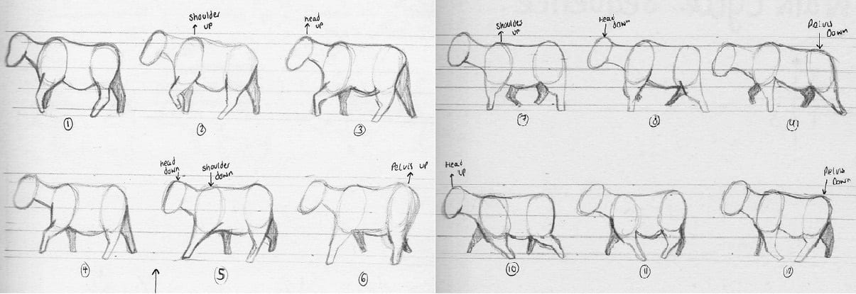
Animation is under way, a big part of what I’ve done so far was getting a walk cycle right. Cows walk rather oddly. I used this as a reference for the walk cycle and I think I managed to pull it off realistically enough, though it will probably need some polishing up later on – like adding bodily bobbing for example.
koewalkcycle

A short example of how the animating is coming along and how I have practically applied the visual style I developed:

http://youtu.be/DCu7Bka02z8

It took me a while to make that walk cycle work, I either need a better way of doing it or more scenes without walking I think… we shall see.


NB: I wrote this post last week but forgot to post it from a draft so my work has moved along a bit more from this, though not a huge deal to be honest as I have had deadlines for other modules.
I will make a new post later this week to show further progression, I will also detail in that post a fairly important decision I’ve made regarding duration/form.

Style

My idea for animation style has been fluctuating a bit on this project. I couldn’t do 3D animation in time, I probably couldn’t do a full traditional 2D animation like Watership Down in time, also I’ve been concerned about what animation style would be appropriate.

I’ve been looking at alternative animation styles like Caroline Leaf’s technique of using sand.

But I think one alternative that I looked at which would be best for this is shadow animation. Specifically Chinese shadow theatre.

I think the use of shadow animation is a good choice for several reasons:
a) It can tell a serious/sad story well; it was first used in China when Emperor Wu of the Han Dynasty’s concubine died to ‘bring her back to life’.

b) It would be visually appealing to a younger audience.

https://www.youtube.com/watch?v=NZBr8IPNQ_Q

c) It has a lot of potential – for creating good visual effects and such.

https://www.youtube.com/watch?v=rPqKlJd2SAc

I was planning on using cardboard and paper and physically building and animating however I’ve decided to go digital with it. Partly due to time constraints and partly due to the potentially greater versatility of doing it digitally. I’m now trying to use a mix of shadow theatre (using 3D objects and lighting in After Effects) and simple 2D animation.

Capture

Note: these were just ripped & edited images for test purposes and aren’t in any way final.

A notable practitioner that uses shadow animation well is Lotte Reiniger.

https://www.youtube.com/watch?v=zCR-GFKmMGU

For my character design when I actually create them I would like to use a ‘cardboard’-ish style, similar to that of Don’t Starve (videogame).

I think this style would work well with both the use of shadow animation and with the serious subject. Additionally it is visually appealing to a younger audience, some children’s shows that spring to mind that also use a somewhat cardboard-ish style (though not quite like Don’t Starve) are Sarah & Duck, Lily’s Driftwood Bay and Charlie & Lola.

Also, I think colour-wise I want to use black and white (grayscale) rather than full colour. I think it’s more effective in this case and will also look better with the use of shadows. I might also use red with this as in Schindler’s ListThe Saboteur (video game) and other examples but I’m not definite on this yet.

Examples that employ some of things I’ve been talking about are The Circle Line by Adam Wells and the video game Limbo. Cardboard/paper sort of style, use of shadows/silhouettes, black & white, dark story etc.

Research & Development

I have come up with a title for my animation. I have chosen to call it Chaphash (pron: “khaw + fash”) which means ‘to be free’ in Hebrew.

Also I have now got what I think is a pretty nice visual style for my R&D file. I didn’t really know what sort of thing would be appropriate to go with my animation initially but I then found a journal online which has a style which I think is simple, ‘professional-looking’ yet still effective, appropriate and aesthetically pleasing. The cover is interesting and well designed, balanced by the simple, easily legible use of text on the inside.
The journal is called From The Last Extermination: Journal For The History Of The Jewish People During The Nazi Regime. I’ve based my file on the second issue which I think had the best colour design. You can take a look at the other issues here.

Treatment & Thoughts

At this point I have written a treatment of my animation. Some things might still change but I think it’s a pretty final general outline of the story.

Additionally, I attended a lecture from a Holocaust survivor yesterday. It was particularly interesting and relevant to me due to the child perspective of his story and also the focus on emotional aspects as he was too young at the time to understand the politics and such. He also spoke briefly about his work in educating people about the Holocaust and I found it very interesting that he said that he had to make a small joke now and then and tell his story quite lightheartedly, despite the pain he still feels, to keep an audience and to convey it in an emotionally manageable way (for him and his audience). I think this is something I can keep in mind with my work.

In terms of my actual work, one thing I’m struggling with is a title but this will come in time and it could really be one of the last things I do. Another struggle, or concern, I have is that with using animals I’m not sure exactly how much I want to incorporate human things. By this I mean there is a train in the story and a house; these kind of have to be included but do the animals wear clothes? Or use guns? There are really three ways of incorporating human objects with anthropomorphism: 1) animals are aware of human things but they are human things and humans exist and use them e.g. Watership Down, 101 Dalmations; 2) Humans don’t exist but things still do and in this case are created and used by the animals in place of people, including everything from vehicles to houses to clothes e.g. My Little Pony, Disney’s Robin Hood; 3) Humans exist with their things but animals have their own equivalents or have adapted human things into their own, particularly with clothes/accessories/etc. e.g. Chicken Run, Aristocats.


I think the best for mine would be the second choice. I think this is the most easily relatable option for children and also I don’t really want humans to exist at all within the universe of my animation – consider it really as an ‘alternate’ history where the same thing happened but with animals, as with Robin Hood which also, basically, retells a historical story just with animals in place of people.

Progress & Decisions

So far I have decided on 2D animation over 3D due to time scale and my ability but will continue to look into 3D animation on the side. I also have the general plot of my animation (based roughly on the true story that I mentioned before). I have decided to stick with the concentration camp story, I know that I will have to be careful in telling the story meaningfully and avoiding being offensive, but I think I can do it with this story which as I said is more about the emotional aspects of being liberated and the aftermath than the horrific experience of the camp. I have also decided definitely to tell this story using animals rather than humans. I think Disney are a great place to look for how to tell serious/dark narratives for children using animals, particularly where violence/death is concerned. Other notable examples are Animal Farm which I have mentioned a couple of times previously and Watership Down, some of which Richard Adams based on his war experience. Also, Adams said “I do not believe in talking down to children” when discussing the dark/gruesome images of the novel/animation which I think is an important standpoint to take with this kind of topic. Mine is a different kind of serious to these stories, but I think the way I envision telling it will still be appropriate, particularly in “empathetic understanding” that history education ‘develops and employs’ in children (Primary Curriculum – Teaching the Foundation Subjects, 65).


I have not started adapting this yet into my screenplay/storyboard yet but I will do very soon.

I started sketching some (very) basic character designs and exploring different drawing styles, narrowing down how I might like my animation to look – for example the Disney style of drawing would not be appropriate for this I feel as it is too ‘comic’ and ‘soft’. A style closer to that of Watership Down (the 1978 version) or Animal Farm would be more appropriate as it feels a little more serious in it’s ‘harder’ lines, closer realism and darker colour palette.

I have drawn the main characters as cows and a yak (only because of the name Yakov and to add some visual variety) mainly because in real life they were actually treated as ‘cattle’: “the SS herded us into open cattle cars”. I was also considering pigs, horses, other livestock/farm animals for secondary characters but I’m not certain.

For other characters (which I have not started drawing yet), I am looking towards historical and cultural (including pop culture) associations and tropes. For example I was thinking of animals such as wolves and German shepherds for the SS, perhaps bulldogs, horses, foxes, rabbits and so on for Allied troops.

I have also been considering ‘visual style’ a little. For example, I think I would like to use a ‘Yiddish-style’ font, probably for the title.
Maybe something like these:
Screen Shot 2015-02-19 at 11.10.59 Screen Shot 2015-02-19 at 11.11.16Screen Shot 2015-02-19 at 11.48.15