Convergent

This week we began the convergence task in which we must bring together all the skills we have learnt over the semester.

We have to come up with a new digital technology, showing how it would be used (interaction) and who it would be aimed at (user-orientated design) and present it using a 2 page PDF (interactive publishing) and a 60 second video (animation/compositing).

I chose the ‘make simple music’ category.
Originally I had the idea of doing a small dongle that would plug into any electronic instrument (keyboard, electric guitar, electric drums, etc.) and allow the user to record a multitrack song wirelessly to a PC or mobile device:

20141126123817

However, as James pointed out, this had a lot of problems: it wasn’t really for making SIMPLE music, it was restrictive/exclusive (you still had to own instruments), it wasn’t very ambitious (similar devices already exist, e.g. Chromecast).


So, after talking with James a bit I changed my idea. Now it is a small musical camera/projector hybrid device. The camera recognises objects and processes them into a sound dependent on physical properties like colour, size, etc. & the projector part was to create a visual representation of the ‘sound field’ against a wall (or other surface) so that it was not restricted to people who owned PCs/devices (i.e. third-world countries, etc.) – far more inclusive than the previous idea.

Here’s my initial sketches for it:

2014112612383920141126123752

I did some research into object recognition and the idea certainly seems plausible with things like Google‘s object-recognition project and an object recognition camera called Pixy already being worked on.
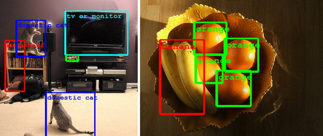
 

As well as the object recognition side it’s also perfectly plausible for that to be turned into creating a variety of sounds as the idea is similar to things like the V Project which uses human motions to create music.

I also started a bit of work on the ‘branding’ side, designing a logo and beginning to storyboard the video.
Untitled-320141126134258


Based on that initial blue/black design, I took to ColourLovers again and have found a great palette called ‘spinning bird kick‘ by alpen.

spinningbirdkick

Re-Application Through Labour

Last week James asked us to pick one of the bad apps we found and do two things with it:

a) redesign the logo/branding

b) redesign the UI of the app

We also looked at rich and flat designs and a lot of dos and don’ts of logo design.

I personally far prefer flat designs to rich and so that’s what I’ll be going for, not least because the good part of the app I’m improving (myCity, see previous post) was the pretty flat main screen, the bad parts were more rich.

This is what the app actually looks like:

unnamed unnamed-1


Here are my redesign notes/sketches that I did in preparation for the second workshop:

2014111314450520141113144453

The colour palette I picked was from ColourLovers, a great site that I use a lot.
The fonts I liked for it were called Exo 2.0 and Hallo Sans.

In the workshop we first used Illustrator to practice making vector logos using this little bird.
bird

Then we went on to put our own redesigns into practice beginning with the logo. The first draft did look fine, but in practice it didn’t fit well to the mobile dimensions (it might’ve been more appropriate for say a letter-head), which is why I adapted it the final version; removing the circle and (re)moving the text – which I placed beside it in Photoshop instead.
My process: app icon > my sketches > first draft (Ai) > final (Ai).

>20141113144351>MYCITYLOGO>Web

After that we copied the vector logo into Photoshop and began on the UI redesign, using free UI kits (though I only copied a rectangle over which I then changed the colour of anyway).

I gathered some free icon SVGs (below) from FlatIcon (IcoMoon was another option but I prefer the search feature on FlatIcon).
icons

I recoloured the icons in Ai to suit my colour scheme and then copied them over into Ps just like the logo.
Eventually after adding all my icons and squares and rectangles, the finished redesign looked like this:

redesigniPhone-5

I’m pretty pleased with it (these images are a bit low-res but it was obviously a lot crisper in Ps), I think it’s a definite improvement on the original but given more time I would have put a bit more work into it like adding text perhaps to accompany the icons as not all of them may be clear or maybe brighten the colours up a bit. But for the time constraints and everything I think it went quite well.

The Good, The Bad, The Ugly Apps

This week we’ve been assigned some topics (I have Local Government) and we have been asked to look at Apps which could be improved upon in terms of user-orientated design, so I’m going to have a look on the iOS/Android app stores then give a brief analysis of apps’ designs and how they could be improved.


1. myCity – City of Calgary (bad)

This app is one of five that Calgary local government released to help it’s residents. This one in particular is about employment within local government. It’s described as being “designed for new, existing and potential City of Calgary employees”.

 unnamedunnamed-1

In my opinion this is pretty poorly designed. For one, the pictures of what I assume are current or previous employees. Probably intended to feel more welcoming  and give a sense of community for employees but I don’t think it really gets this across. The colour scheme seems okay if a little dull but when you get to another page (right) it completely changes. The ‘job opportunities’ page does not look easy to navigate – despite the ugly search bar – it really looks like an early HTML page with too much going on.

unnamed-2

This is another screen from it where the user can see traffic cameras/a map. I don’t really know why this would be helpful but in terms of design it’s still poor: the mugshot header returns, there’s a massive gap between this banner and the actual content (which wasn’t there on the above screen – no continuity), plus the general design feels outdated – perhaps less outlined and squarer buttons or simple clickable icons for example a heart instead of “remove from favorite”.


2. go2Guides – Australia (bad)

An app supported by the Australian council intended to help “tourists and locals” find info on popular locations, hotels, events, shops, etc.
“Book a ROOM, book a TABLE, buy a TICKET, buy a BOOK!”.

Screen Shot 2014-11-06 at 10.44.09 1

This is their website which looks very appealing and has a nice, contemporary, simple UI. However, it is somewhat deceiving because the actual app is a terrible mess.

screen568x568 screen568x568-1 screen568x568-2

There is no continuity whatsoever to start with. Each page looks different. That wouldn’t be so bad if each page looked good but the colour schemes are abysmal (middle) with random icons (poorly designed too). The general style of it (if there is one) is also again one which looks like early HTML.

3. Elk Grove – California (goodish)

The city of Elk Grove, CA released this app “to provide a tool to enable residents to more easily interact with the city”.

It allows residents to submit issues/requests for improving the city or report any disturbances, etc. to the local government. It also provides general information about the city.

589c76d9

The main screen of the app (left) has a nice colour scheme and the logo looks good. The information is pretty clearly displayed and it’s obvious where each section will lead to.

Further into the app e.g. Requests (right) the UI dissolves somewhat – poor, random (City Info=a planet??) and somewhat unnecessary icons along the bottom and a totally different colour scheme. Despite this though it’s not THAT bad, the screen still looks okay on it’s own and overall the app seems good enough to use – room for improvement though.

UPDATE: found a newer version of the app which actually has been redesigned and pretty well actually, it looks much nicer and easier to use now and they’ve just vastly improved it from icons to colour scheme:
Elk Grove PublicStuff - screenshotElk Grove PublicStuff - screenshotElk Grove PublicStuff - screenshotElk Grove PublicStuff - screenshot